Connect with us

How To

Mind Mapping in Design Thinking: A Practical Guide for Creatives

Published

on

Unlocking Creativity with Visual Thinking

Ever stared at a notebook filled with frantic scribbles, trying to make sense of a brainstorm? You’re not alone. Traditional note-taking often creates more confusion than clarity, especially when tackling complex design challenges. That’s where mind mapping comes in—a powerful visual tool that mirrors how our brains naturally work.

Think of it as a structured brainstorm on paper. A mind map starts with a central idea and radiates outward with connected thoughts, creating a web of associations. This isn’t just about drawing pretty diagrams. It’s a practical method for capturing the chaotic energy of creativity and giving it a clear, actionable form.

The Core of Design Thinking

Before diving into mapping, let’s ground ourselves in design thinking. At its heart, this process is a human-centered approach to problem-solving. It’s not just for designers in black turtlenecks. Engineers, product managers, and entrepreneurs use it to create solutions that people actually want and need.

The classic framework moves through five key stages: Empathize, Define, Ideate, Prototype, and Test. Each phase builds upon the last, transforming vague hunches into tangible products. The goal is simple but profound—to understand users deeply and solve their real problems, not just the symptoms.

Where Mind Mapping Fits In

Mind mapping acts as a Swiss Army knife within this process. It’s particularly potent during the early, fuzzy stages. When you’re empathizing with users, a map can capture pain points and observations. During the Define phase, it helps crystallize the core problem statement. And in the Ideate stage, it becomes a launchpad for generating wild, innovative solutions without judgment.

The magic happens in its flexibility. A single map can hold user quotes, technical constraints, feature ideas, and emotional insights—all visually connected. This holistic view prevents teams from getting lost in details too early and keeps the big picture front and center.

Building Your First Design Mind Map

Ready to try it? Start with a blank surface—physical or digital. Write your core challenge or user need in the center. This is your anchor. Now, draw branches radiating out. Label these with major themes: “User Pains,” “Technical Feasibility,” “Business Goals,” “Feature Ideas.”

From each branch, grow smaller twigs. Under “User Pains,” you might add “long wait times,” “confusing interface,” “lack of customization.” Don’t edit yourself yet. The goal is volume and variety. Use colors, icons, or simple sketches to differentiate concepts. A red branch might signal urgent problems; a green one could highlight opportunities.

This isn’t about creating a masterpiece. It’s about externalizing your team’s collective thinking. The messy, interconnected nature of the map often reveals relationships you’d miss in a bulleted list. That unexpected connection between a user frustration and a technical capability? That’s where breakthrough ideas are born.

From Map to Reality: Practical Applications

So you’ve filled a whiteboard with ideas. What now? A well-crafted mind map becomes a living blueprint for your project. It informs feature prioritization, shapes user stories, and guides prototyping decisions. Before a single wireframe is drawn, the team agrees on what they’re building and why.

Consider a team designing a new fitness app. Their mind map might reveal that users care more about social accountability than tracking calories. That insight shifts the entire product direction. Instead of building complex nutrition databases, the team focuses on group challenges and sharing features. The map saved them months of wasted effort.

This tool also democratizes collaboration. When everyone can see how their idea connects to the whole, discussions become more productive. The quiet engineer in the corner might spot a potential integration that the loudest marketer missed. Visual thinking levels the playing field.

Pro Tips for Effective Mapping

Keep it simple early on. A short, focused map often contains more actionable insight than a sprawling masterpiece. Use one map per core objective to avoid cognitive overload. Embrace the mess—collect every idea, even the seemingly useless ones. They often spark the best solutions later.

Indicate hierarchy visually. Thicker branches for major themes, thinner ones for details. This visual cue helps teams quickly distinguish strategic pillars from implementation details. When it’s time to create wireframes, this hierarchy translates directly into information architecture.

Remember, the map is a means, not an end. Its value lies in the conversations it sparks and the clarity it provides. Don’t get bogged down making it beautiful. Focus on making it useful.

Transforming Your Design Practice

Mind mapping won’t solve every design challenge. But it will bring structure to your creativity and alignment to your team. It turns abstract thinking into something you can see, discuss, and refine. In the fast-paced world of product development, that visual anchor is invaluable.

The next time you face a complex problem, grab a marker. Start with a central question and let your thoughts flow outward. You might be surprised by what emerges. That simple act of mapping can reveal patterns, expose assumptions, and illuminate paths forward that linear thinking would miss.

Great design isn’t about having a single brilliant idea. It’s about connecting many ideas in novel ways. A mind map makes those connections visible. It turns the solitary act of thinking into a collaborative journey toward better solutions. And in the end, that’s what design thinking is all about.

Continue Reading

Social Media

Retro, the anti-algorithm photo app for friends, just banked $21M

Published

on

Retro photo-sharing app

Retro’s quiet $21M raise

The friend-focused photo-sharing app Retro has pulled in more than $21 million in Series A funding, according to an SEC filing spotted by Business Insider. The filing, dated August 19, sits under the startup’s legal name, Lone Palm Labs, and reveals the round actually closed back in December.

PitchBook now pegs the company’s valuation north of $100 million. Retro hasn’t commented publicly on the raise, and didn’t respond to a request for comment.

The money comes at a telling moment. Social media has become a firehose of creator content, algorithmically ranked and increasingly generated by AI. Retro’s pitch is almost contrarian: show photos to the people who actually know you.

Built by ex-Instagram engineers who saw the feed problem coming

Retro was founded by Nathan Sharp and Ryan Olson, two former Instagram product engineers. They watched the platform drift from a friend-sharing tool into a broadcast network dominated by influencers. Sharp told TechCrunch in December: “Something that has to be true and will be true is that people will still want to see more of their friends.”

His point cuts to the heart of the current social media malaise. The For You page is great for killing time, but it’s terrible for staying connected. Sharp again: “The photos and videos you take will need to find a place where they can reach the intended audience.”

Retro is that place. It strips away the algorithmic noise and puts the focus squarely on your inner circle.

From personal journal to shared photo space

Launched in 2023 as a personal photo journal, Retro has evolved. It now lets you privately share photos of your week with friends, create shared albums, view and share recaps, and even “rewind” to time-travel through old memories. The app has become a go-to for groups who want a shared visual history without the performance of posting to a public feed.

The growth numbers back up the concept. According to app intelligence provider Appfigures, Retro has been downloaded about 7 million times since launch. In-app spending has jumped more than 460% over the past 180 days — a sign that the people who do subscribe are sticking around and using it regularly.

No ads, just subscriptions

Retro’s business model is refreshingly simple: no advertising. Instead, the company offers in-app subscriptions that unlock features like video, GIF and sticker comments, more styles, unlimited history, and special app icons.

It’s a small subset of users who pay, but the company’s bet is that those who do are committed customers. The subscription model also aligns with the app’s ethos — your data and attention aren’t the product.

Who’s backing the anti-algorithm bet?

The investor list reads like a who’s who of tech and venture circles. Thrive Capital leads the round, joined by Figma CEO Dylan Field, Scribble Ventures, Box Group, Imaginary Ventures, Coalition, Conviction, Copper, Positive Sum, and a roster of angels.

The mix of strategic and financial backers suggests confidence in Retro’s vision. Field, who runs a design tool company, likely sees the value in a social app that prioritizes genuine connection over engagement metrics.

What Retro’s raise says about the future of social

The $21M round is more than just a milestone for one startup. It’s a signal that investors are betting on a future where social media returns to its roots — connecting real people with real friends. As AI-generated content floods mainstream platforms, the demand for authentic, private sharing spaces is only growing.

Retro isn’t trying to replace Instagram or TikTok. It’s carving out a niche for something more intimate. And with this fresh capital, the team plans to keep building features that make it easier to share moments with the people who matter most.

For anyone tired of doomscrolling through sponsored posts and AI slop, Retro’s photo-sharing app offers a quiet alternative. The question now is whether it can scale its niche appeal into something bigger. The early numbers suggest it’s on the right track.

Continue Reading

How To

5 Overlooked Pixel Apps I Added to My Home Screen Because I Kept Forgetting to Use Them

Published

on

overlooked Pixel apps

Why Your Pixel Home Screen Deserves a Second Look

Google’s Pixel phones are stuffed with exclusive features. That’s not hyperbole—it’s practically the brand’s identity. But here’s the thing: many of those features are hiding in plain sight, tucked inside apps you’ve probably swiped past a hundred times.

I’m guilty of it too. I’d buy a Pixel, marvel at the camera, then completely forget about the software tricks that make the phone genuinely useful. So I did something about it. I moved five overlooked Pixel apps to my home screen. Now I actually use them.

1. Recorder: The App That Transcribes Everything

You know that feeling when you’re in a meeting or lecture, and you desperately wish you had a transcript? The Pixel Recorder app does exactly that—and it’s been on Pixels since the Pixel 4.

It’s not just a voice recorder. It transcribes audio in real time, even when you’re offline. You can search for specific words in a recording, which is a lifesaver when you’re trying to find that one action item from a two-hour call.

I added it to my home screen because I kept forgetting I had it. Now, whenever I’m about to take notes on a conversation, I just hit record instead. The transcription is shockingly accurate, and it’s one of the most underrated Google Pixel features.

2. Now Playing: Your Personal Shazam, Always On

Every Pixel has a feature called Now Playing. It listens in the background and identifies music playing around you—no app needed. The catch? It’s buried in the settings, and most people never turn it on.

Here’s what I did: I added the Now Playing history shortcut to my home screen. It’s a widget that shows a list of every song the phone has recognized recently. Tap a song, and it opens in YouTube Music or your streaming app of choice.

Why does this matter? Because you won’t have to pull out your phone and open Shazam every time you hear a tune you like. The Pixel does it silently, and you just check the history later. It’s one of the best Pixel exclusive apps you’re not using.

3. Digital Wellbeing: More Than Just a Timer

Digital Wellbeing sounds like a guilt-trip app, but it’s actually a goldmine of hidden tools. The app tracks your screen time, sure, but it also has a Focus mode that silences distracting apps when you need to concentrate.

What really sold me, though, is the Wind Down feature. It shifts your screen to grayscale at a set time, which makes doomscrolling feel less appealing. I put a shortcut to Digital Wellbeing on my home screen because I kept forgetting to set it up properly.

Now I use it every evening. It’s a small nudge, but it’s genuinely changed how I wind down. If you’re looking for Pixel productivity tips, this is a good place to start.

4. Files by Google: The Cleanup Tool You Actually Need

Files by Google isn’t exclusive to Pixel, but it comes pre-installed and is deeply integrated. It’s not just a file manager—it has a smart cleanup feature that suggests old photos, memes, and unused APKs to delete.

I used to ignore it because I thought it was just a boring file browser. Then I checked the “Clean” tab one day. It found 2 GB of junk I didn’t know existed. That was the moment I moved it to my home screen.

The app also lets you share files offline with nearby devices, which is handy when you’re in a dead zone. If you’re tired of “storage full” notifications, this is the overlooked Pixel app you need.

5. Google Lens: The Visual Search Powerhouse

Google Lens is technically part of the Google app, but it deserves its own spot on your home screen. It’s a visual search tool that can identify plants, translate text in real time, and even solve math problems by pointing your camera at them.

I kept forgetting it existed because it’s hidden behind a few taps in the Google app. So I added the Lens shortcut directly to my home screen. Now, when I’m at a museum and want to know more about a painting, or when I’m trying to read a menu in another language, it’s one tap away.

It’s one of the most versatile hidden Google Pixel features, and it’s free. No reason not to use it.

How to Add These Apps to Your Home Screen

Adding any of these to your home screen takes about ten seconds. Here’s how:

  • Open your app drawer and find the app you want.
  • Press and hold the icon.
  • Drag it to your home screen.
  • For widgets like Now Playing, press and hold an empty spot on your home screen, tap “Widgets,” and search for the app.

That’s it. You’ll actually see them every time you unlock your phone, which is the whole point.

Don’t Let These Features Collect Dust

Pixels are packed with Google Pixel tips and tricks, but they only help if you remember they exist. Moving these five overlooked Pixel apps to my home screen was a small change that made a big difference in how I use my phone.

Try it. You might be surprised at how often you reach for them.

Continue Reading

How To

Windows 11 August 2026 Update: Apps Open Way Faster Now — KB5121003 Tested

Published

on

Windows 11 August 2026 update

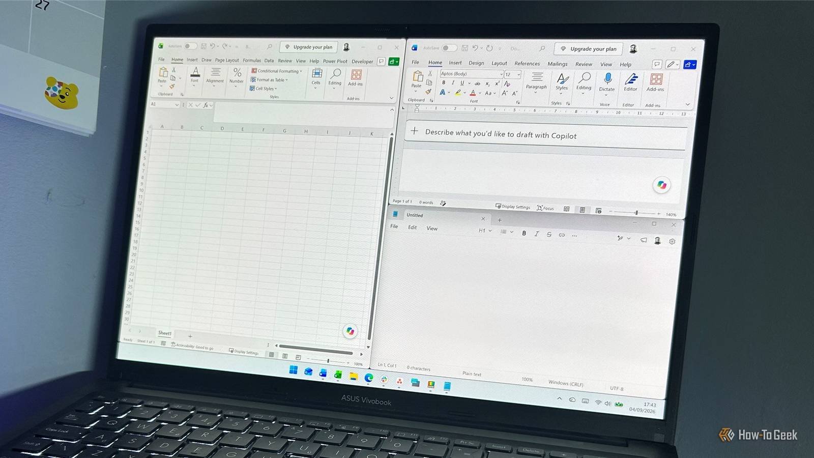
Imagine clicking an app icon and watching it spring to life instantly—no spinning cursor, no gray freeze, just pure speed. That’s exactly what Microsoft’s latest Windows 11 update promises, and after testing it myself, I can confirm: the difference is real. The August 2026 patch, KB5121003 (build 26200.9168), takes the CPU boost feature that previously only sped up the Start menu and search and extends it to your actual applications. The result? Apps open noticeably faster, and that annoying gray screen freeze after idle or boot is gone. Here’s what’s happening under the hood, why your CPU isn’t in danger, and why Microsoft probably should’ve done this years ago.

Continue Reading

Trending