Connect with us

How To

Hide WhatsApp Blue Ticks: A Complete Guide for Android and iPhone

Published

on

Hide WhatsApp Blue Ticks: A Complete Guide for Android and iPhone

That little blue checkmark. For some, it’s a simple confirmation. For others, it’s a source of anxiety, pressure, and overthinking. The WhatsApp read receipt—the infamous blue tick—has quietly reshaped how we communicate. It tells the sender you’ve seen their message, whether you’re ready to reply or not.

Ever felt that subtle pressure to respond immediately after opening a chat? You’re not alone. Many users seek ways to reclaim a bit of digital privacy and mental space by turning this feature off. The good news is you can disable it, but there are trade-offs and important details to understand first.

Understanding WhatsApp’s Tick System

Before you change any settings, it helps to know what those symbols actually mean. WhatsApp uses a simple visual code to show a message’s journey from your phone to someone else’s screen.

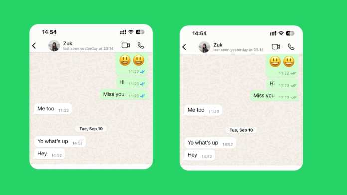
When you hit send, a single grey clock icon appears. This means your message is queued, waiting for a stable internet connection. Once it’s sent from your device, the clock turns into one grey tick. That’s WhatsApp confirming it has your message.

Two grey ticks mean the message has successfully landed on the recipient’s phone. It’s delivered. This doesn’t mean they’ve seen it—just that it’s sitting in their notifications or chat list.

Here’s where the social contract changes. When those two grey ticks turn blue, the app signals that the recipient has opened the chat and seen the message. Technically, WhatsApp only confirms the chat was opened, not that every word was read, but the implication is clear.

This system creates a peculiar modern dilemma. That blue double-check can trigger a cascade of questions: Are they ignoring me? Should I follow up? Why no reply? Disabling read receipts is often about silencing that internal noise.

How to Turn Off Blue Ticks on Android

The process on Android is straightforward. Remember one crucial rule upfront: this is a mutual setting. If you turn off your read receipts, you also won’t see when others read your messages. It’s a two-way street.

Here’s the step-by-step process:

Step 1: Open your WhatsApp application.

Step 2: Tap the three vertical dots in the top-right corner to open the menu.

Step 3: Select “Settings” from the list.

Step 4: Tap on “Privacy.”

Step 5: Scroll down until you find “Read receipts.”

Step 6: Toggle the switch to the OFF position.

The change takes effect immediately. Your sent messages will no longer show blue ticks to the sender, and you’ll lose the ability to see blue ticks on messages you send to others.

Important Android Limitations

This setting has clear boundaries. It applies only to your private, one-on-one chats. Group chats are a different story. WhatsApp maintains transparency in groups, so even with your read receipts off, blue ticks will still appear for messages you read in any group.

Voice messages also play by their own rules. When you listen to a voice note, the microphone icon next to it will turn blue for the sender, indicating playback. This happens regardless of your read receipt setting. WhatsApp treats listening as a separate action you can’t hide.

How to Turn Off Blue Ticks on iPhone

iPhone users follow a nearly identical path, just with a slightly different interface.

Step 1: Launch WhatsApp on your iPhone.

Step 2: Tap the “Settings” tab in the bottom-right corner.

Step 3: Select “Privacy.”

Step 4: Find and tap “Read Receipts.”

Step 5: Toggle the setting off.

That’s it. Your blue ticks are now disabled for individual chats.

Important iPhone Notes

Just like on Android, the grey ticks (single and double) will still show for message delivery. This setting is independent of your “Last Seen” or “Online” status. Those are controlled separately within the same Privacy menu.

The group chat rule is universal. No matter your device—Android, iPhone, or even WhatsApp Web—you cannot disable read receipts in group conversations. The blue ticks will always show there.

The Pros and Cons of Disabling Read Receipts

Is turning off blue ticks the right move for you? Let’s weigh the practical effects.

The Advantages: You gain significant privacy. You can read messages on your own time without the sender knowing you’ve seen them. This reduces the pressure for an instant reply, which is perfect for busy schedules, focused work sessions, or simply avoiding awkward social expectations. It gives you back a sense of control over your attention.

The Disadvantages: The trade-off is total. You lose the ability to see when others read your messages. This can be frustrating if you’re waiting for an important confirmation or reply. For business communication, this lack of transparency can sometimes erode trust, as customers can’t see that you’ve acknowledged their message.

The decision often comes down to your primary use case. Are you managing personal chats where boundaries are helpful? Or are you using WhatsApp for customer support, where visibility builds confidence?

Special Cases: WhatsApp Web, Desktop, and Business

What about other versions of WhatsApp? The rule is simple: the setting on your mobile phone controls everything. If you disable read receipts in the Android or iPhone app, that setting automatically applies to WhatsApp Web and the Desktop app. There’s no separate toggle on those platforms.

For WhatsApp Business users, the option exists in the same Privacy menu. The steps are identical. However, business accounts should consider the impact more carefully.

For many small businesses, the blue tick is a powerful tool. It shows customers their message has been seen, which can be reassuring, especially for complaints or urgent inquiries. Turning it off might leave customers feeling ignored. If your business uses WhatsApp primarily for broadcasting announcements (not two-way support), disabling receipts might be acceptable. For active customer service, keeping them on is usually the better strategy.

Making Your Decision

Disabling WhatsApp’s blue ticks is a personal choice centered on digital wellbeing. It’s a tool for reducing notification anxiety and reclaiming a small piece of conversational privacy.

Just go in with your eyes open. You’re choosing a path of mutual invisibility. You won’t see their reads, and they won’t see yours. Group chats and voice notes remain fully transparent, by WhatsApp’s design.

Think about your communication style. Do you value the unspoken accountability the blue ticks create? Or do you prefer the freedom to process messages without a digital audience? Your answer will guide you to the right setting for your peace of mind.

Continue Reading
Click to comment

Leave a Reply

Your email address will not be published. Required fields are marked *

Social Media

Microsoft Cloud for Startups: Technical Documentation and Previous Versions

Published

on

Navigating Microsoft’s Technical Documentation for Startup Growth

Launching a startup is an exhilarating challenge. You’re building something from scratch, often with limited resources and immense pressure to succeed quickly. The right technology foundation isn’t just helpful—it’s critical for survival and scaling. Microsoft Cloud offers a comprehensive suite of tools designed specifically for this journey. But where do you begin? The answer often lies in the extensive technical documentation, including access to previous versions, which provides a roadmap for implementation and troubleshooting.

Think of this documentation as your engineering team’s playbook. It details how to configure services, integrate systems, and maintain security protocols. For a startup CTO or lead developer, these resources are invaluable. They reduce guesswork, accelerate deployment, and help avoid costly technical missteps early in the company’s lifecycle. Having access to both current and archived documentation means you can understand the evolution of a service and manage updates without breaking existing functionality.

Building a Secure and Compliant Foundation from Day One

Security and compliance aren’t luxuries reserved for established enterprises. Customers today demand that their data is protected, regardless of a company’s size or age. A single breach can destroy a startup’s reputation before it even gets off the ground. Microsoft Cloud addresses this head-on by embedding robust security controls and compliance frameworks directly into its services.

The technical documentation guides startups through implementing these features correctly. It explains how to set up identity and access management, encrypt sensitive data, and configure network security. For startups operating in regulated industries like fintech or healthtech, the compliance guidance is particularly crucial. It helps navigate complex standards such as GDPR, HIPAA, or SOC 2, turning a potential obstacle into a competitive advantage. Building with security and compliance in mind from the start is far easier than retrofitting it later.

Why Previous Versions of Documentation Matter

Software and cloud services evolve constantly. New features are added, APIs are updated, and interfaces change. While moving forward is essential, startups often operate on specific, stable versions of a service. Perhaps a critical integration was built on an earlier API version, or a budget freeze delayed an upgrade cycle. This is where archived technical documentation becomes a lifeline.

Access to previous versions allows developers to accurately maintain and troubleshoot their current environment. It provides context for why certain configurations were made and offers solutions for issues that may no longer be present in the latest release. This historical perspective prevents disruptions and gives technical teams the confidence to manage their stack effectively, even when they can’t immediately adopt the newest tools.

Accelerating Development and Scaling Operations

Speed is the currency of the startup world. The faster you can build, test, and deploy, the quicker you can learn from the market and iterate. Microsoft Cloud’s services, from Azure App Service to GitHub and Power Platform, are built for rapid development. The accompanying documentation provides the practical know-how to harness this speed.

Step-by-step tutorials, code samples, and architecture best practices help small teams achieve big results. They show how to automate deployments, set up continuous integration and delivery (CI/CD), and monitor application performance. As user numbers grow, the documentation also outlines scaling strategies—how to efficiently add more compute power, manage database load, and optimize costs. This guidance empowers startups to focus on their core product innovation, not the underlying infrastructure headaches.

Ultimately, technical documentation is more than just a reference manual. For a startup leveraging the Microsoft Cloud, it’s a strategic asset. It provides the clarity and depth needed to build a resilient, secure, and scalable business. By understanding both the current tools and their historical context, startup teams can make informed decisions, mitigate risks, and lay a foundation for long-term success. The cloud provides the power; the documentation provides the blueprint to use it wisely.

Continue Reading

Social Media

Facebook Developer Page Not Found: How to Fix Broken Links

Published

on

Why You’re Seeing a ‘Page Not Found’ Error

You clicked a link expecting developer documentation, an API guide, or a tool from Meta. Instead, you landed on a dead end. This ‘Page Not Found’ message is frustrating, but it’s a common occurrence on large, evolving platforms. The digital landscape of Facebook for Developers is constantly shifting. APIs get deprecated, tools are consolidated, and documentation is restructured for clarity. The link you followed might have been correct yesterday but is simply outdated today.

Think of it like a library that’s constantly reorganizing its shelves. The book you’re looking for hasn’t vanished; it’s just been moved to a new section. The same principle applies here. The resource you need likely still exists, but its address has changed.

What to Do When a Developer Link is Broken

Don’t close the tab in frustration just yet. There are several effective strategies to find what you’re looking for.

Use the Developers Site Search

The most direct action is to use the search function on developers.facebook.com. Be specific with your keywords. Instead of searching for a broad term like “analytics,” try “Marketing API analytics endpoints” or the exact name of the SDK you recall. The internal search engine is your best friend for navigating recent updates.

Navigate from the Main Hub

Start from the homepage. Browse the main documentation sections, product menus, or tools listings. Major resources are rarely deleted without a trace; they are often relocated within the site’s new information architecture. This top-down approach can help you rediscover the content through the official, current navigation paths.

Check Official Channels

Meta often announces major changes, deprecations, or migrations through official blogs, changelogs, or community forums. A quick search for the feature or API name along with “deprecation” or “update” might lead you to an announcement that points to the new location or a recommended alternative.

Reporting Persistent Broken Links

What if you’re certain a critical link is broken and you can’t find an alternative? Reporting it helps improve the platform for everyone. While there isn’t a dedicated “broken link” form, you can use relevant feedback channels.

If the broken link is within a documentation page, look for a “Feedback” or “Report an Issue” button at the bottom. For broader platform issues, the Facebook Developer Support portal is the appropriate place to file a report. Clearly describe the URL you tried, the expected content, and the error you received. This information helps the engineering and documentation teams fix routing issues and update their sitemaps.

Encountering a dead link is a minor hiccup in the development process. With a focused search and a bit of navigation, you’ll almost certainly find the technical answers you need to keep building.

Continue Reading

Social Media

YouTube Subscribe Button: Complete Configuration Guide for Developers

Published

on

YouTube Subscribe Button: Complete Configuration Guide for Developers

Want to grow your YouTube channel directly from your website? The YouTube Subscribe Button is a powerful tool that lets visitors subscribe without leaving your page. It’s a seamless way to convert website traffic into loyal subscribers.

Getting it right matters. A well-configured button can significantly boost your subscription rates. Let’s explore how to set it up effectively.

What the YouTube Subscribe Button Configuration Tool Offers

Google provides a dedicated configuration tool for developers. This interactive interface handles the technical heavy lifting. You don’t need to write complex API calls from scratch.

The tool presents you with several display options. You can choose the channel to promote, select a layout, and decide how the subscriber count appears. Each choice changes the button’s behavior and appearance in real-time.

A live preview updates as you adjust settings. This visual feedback is crucial. You can immediately see how the button will look and function on your site before writing a single line of code.

Step-by-Step Button Configuration

Start by specifying the YouTube channel. You’ll need the channel ID or a valid YouTube username. This ensures subscriptions go to the correct destination.

Next, choose your layout. Options typically include a default button, a full layout showing the channel name, or a more subtle badge-style design. Consider your website’s aesthetic and where the button will be placed.

The subscriber count display is another key setting. You can show the current number of subscribers, which adds social proof. Alternatively, you can hide the count for a cleaner look, especially if your channel is new.

Generating and Implementing the Embed Code

Once you’re satisfied with the preview, the tool generates the embed code. This is usually a simple <script> tag and a <div> container element.

Copy the provided code snippet. Paste it into the HTML of your web page where you want the button to appear. It’s that straightforward. The code handles loading the necessary JavaScript library and rendering the button.

The embedded button is fully interactive. When a logged-in user clicks it, they subscribe instantly. If the user isn’t logged into YouTube, a prompt will ask them to sign in, creating a frictionless subscription journey.

Best Practices for Placement and Integration

Think strategically about placement. Common effective locations include the website header, footer, sidebar, or at the end of blog posts related to your video content.

Make sure the button’s design aligns with your site’s theme. While the core functionality is fixed, its container can be styled with CSS to better match your color scheme and typography.

Always test the button after embedding. Click it from different accounts to ensure the subscription process works flawlessly. Check how it looks on both desktop and mobile devices.

Remember, this button is a direct gateway between your website audience and your YouTube channel. A clear, well-placed call-to-action can turn casual visitors into engaged subscribers, building your community across platforms.

Continue Reading

Trending