Connect with us

How To

WhatsApp Is Getting a Major Interface Redesign: What You Need to Know

Published

on

WhatsApp Is Getting a Major Interface Redesign: What You Need to Know

The world’s most popular messaging platform, WhatsApp, is preparing to roll out a significant WhatsApp interface redesign. This overhaul aims to refresh the user experience with modern design elements and smarter organizational tools. In this article, we break down every change coming to the app and what it means for you.

A Fresh Look with Material Design 3

WhatsApp has long relied on its signature green accents and simple layout. However, the latest Android beta version 2.23.13.16 reveals a dramatic shift. The app now embraces Google’s updated Material Design 3 guidelines, giving the interface a cleaner, more contemporary feel.

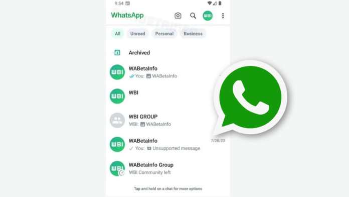
The most immediate change is the top bar, which has turned completely white. While the iconic green logo remains, the overall palette feels lighter and less cluttered. This is a deliberate move to align with modern design trends seen across other major apps.

In addition, WhatsApp has introduced a new brand font. This subtle tweak contributes to the app’s refreshed appearance without sacrificing readability. The result is a more polished look that still feels familiar.

Smart Chat Filters for Better Organization

One of the standout features of the WhatsApp interface redesign is the introduction of advanced chat filters. These filters sit at the top of the chat list, allowing users to quickly sort conversations. You can now filter by unread messages, personal chats, and business communications.

This builds on an earlier beta version that included a basic filter. The updated version is more robust and will become even more valuable once WhatsApp launches its multi-account feature. Organizing multiple accounts will be much easier with these filters in place.

For users who juggle work and personal conversations, this is a welcome addition. It reduces scrolling and helps you focus on what matters most.

Navigation Tweaks and Lingering Questions

While the visual updates are exciting, some navigation details remain unclear. The bottom navigation bar is still present in the new design, but it is uncertain whether users will be able to swipe between tabs for seamless navigation. This feature has been a staple in many competing apps, and its absence could be a missed opportunity.

WhatsApp has not yet confirmed these details. As with any beta release, some features may change before the public rollout. The company is likely gathering feedback from beta testers to fine-tune the experience.

Despite these uncertainties, the core direction is clear: WhatsApp wants a modern, user-friendly interface that adapts to how people actually use the app. The WhatsApp interface redesign is a step toward that goal.

What This Means for You

If you are a regular WhatsApp user, these changes will make the app feel fresh without requiring you to learn anything new. The layout remains intuitive, and the new filters save time. The Material Design 3 elements also improve visual consistency across Android devices.

For business users, the chat filters are especially useful. Separating personal and professional messages becomes effortless, which is crucial for those managing multiple accounts.

However, not every change may be universally loved. Some users prefer the classic green-heavy design and may find the white top bar too stark. WhatsApp will likely offer customization options in future updates to address these preferences.

When Can You Expect the Update?

WhatsApp is currently testing the redesign with beta users. A stable rollout is expected after successful testing. Based on past patterns, the update could reach all users within a few weeks or months.

To get early access, you can join the WhatsApp Beta program on the Google Play Store. Keep in mind that beta versions may have bugs, so proceed with caution.

For more insights on app updates, check out our guide on top app redesigns to watch in 2025. You might also find our article on WhatsApp tips and tricks helpful for getting the most out of the new features.

Final Thoughts

The WhatsApp interface redesign marks a significant evolution for the messaging giant. With Material Design 3, a cleaner top bar, new fonts, and smarter chat filters, the app is positioning itself for the future. While some navigation questions remain, the overall direction is positive.

Are you excited about the new look? Let us know in the comments below. Your feedback matters as WhatsApp continues to refine this update.

Continue Reading
Click to comment

Leave a Reply

Your email address will not be published. Required fields are marked *

How To

Stop settling for Android’s surface-level automation—Tasker does what Google won’t

Published

on

Tasker automation

Why Android’s built-in automation feels shallow

Most people have dabbled with the smart automation features baked into our phones. Between Samsung’s routines, Google Assistant, and the newer Gemini integrations, it feels like there are plenty of ways to automate a job. But here’s the thing: I’ve always found them disappointingly surface-level, especially when you stack them against the Shortcuts app on iPhones, which is genuinely stellar.

Android’s native tools are fine for the basics—turning on Wi-Fi when you get home, silencing notifications during a meeting. But the moment you want something even slightly unconventional, you hit a wall. Google’s approach is to hand you a few pre-baked recipes and hope you don’t ask for more.

That’s where Tasker automation steps in. It’s been around for over a decade, and it still does things that Google won’t even attempt.

Tasker isn’t just another automation app—it’s a toolbox

Tasker isn’t a single-purpose tool. It’s closer to a Swiss Army knife for your phone’s operating system. You build “profiles” that trigger “tasks” based on conditions you define—time, location, sensor data, app activity, even the content of a notification.

Want your phone to read out incoming texts when you’re driving? Tasker can do that. Want to automatically switch to grayscale mode at 10 PM to curb late-night scrolling? Done. Want to log every time you open Instagram and how long you spend there? Tasker will track it and even generate a report.

The real power, though, comes from its plugin ecosystem. Tools like AutoInput let you simulate taps and swipes, while Tasker’s built-in variables let you create logic loops that would make a programmer smile.

Tasker vs. Samsung Routines: No contest

Samsung’s Routines are slick and user-friendly, no doubt. But they’re also locked down. You can only use the conditions and actions Samsung decided to expose. Tasker, on the other hand, gives you root-level access if you’re willing to go that far, and even without root, it can reach into system settings that Samsung hides away.

Tasker vs. Google Assistant’s routines

Google Assistant routines are voice-first and cloud-dependent. That means they break when your connection is flaky, and they can’t do anything that requires local, real-time processing. Tasker runs entirely on your device, so it’s faster, more private, and infinitely more flexible.

What Tasker can do that Google won’t touch

Let’s get concrete. Here are five things I’ve personally set up with Tasker that would be impossible (or absurdly convoluted) with Google or Samsung’s tools:

  • Notification-based triggers: When a specific app sends a notification with certain text, Tasker can react—like auto-replying to a message from your partner when you’re in a meeting.
  • Sensor fusion: Combine accelerometer data, light sensor readings, and battery level to create a context-aware profile. For example, if the phone is face-down and the room is dark, it could assume you’re asleep and silence everything.
  • Variable manipulation: Store data across profiles, calculate things, and build complex decision trees. It’s like having a mini programming language in your pocket.
  • Auto-input simulation: With the AutoInput plugin, Tasker can physically tap buttons on your screen. That means you can automate apps that don’t offer any official automation hooks.
  • Tasker scenes: Create custom floating buttons or menus that appear over other apps. I’ve built a one-tap timer for my workouts that overlays any screen.

Getting started with Tasker: A quick primer

Tasker has a reputation for being intimidating, and honestly, it deserves it. The interface is dense, and the learning curve is steep. But the payoff is worth it, and there are ways to ease in.

Start with the built-in Tasker 101 tutorial, which walks you through your first profile. Then, browse the best Tasker profiles shared by the community—there are thousands of ready-made ones you can import with a single tap.

You’ll also want to grab a few essential plugins: Tasker itself, plus AutoInput, AutoNotification, and AutoTools. They’re paid, but they turn Tasker from a curiosity into a genuine workhorse.

Beginner mistakes to avoid

  • Don’t try to build everything at once. Pick one small automation and master it before moving on.
  • Read the variable names carefully. A single typo will break your profile silently.
  • Use the “Test” button on every action before you rely on it. Trust me, you’ll save yourself hours of debugging.

Is Tasker still relevant in 2025?

You might be wondering: with all the AI-powered automation coming from Google and Samsung, is Tasker still necessary? The short answer is yes—more than ever.

Gemini and Assistant are great at understanding natural language commands, but they’re still bound by the same API limitations. They can’t reach into the guts of your device the way Tasker can. And as Google continues to lock down Android’s internals for security, Tasker’s community keeps finding workarounds.

Moreover, Tasker has evolved. It now supports JavaScript, has a modernized UI, and integrates with Home Assistant for smart home automation. It’s not a relic; it’s a living project with a dedicated developer and a passionate user base.

The bottom line

If you’re happy with the surface-level automation that Google and Samsung offer, that’s fine. But if you’ve ever felt that nagging itch—the sense that your phone could do so much more—then Tasker automation is the answer. It’s not the easiest path, but it’s the most rewarding one.

Give it a weekend. Import a few profiles. Break something. Fix it. You’ll never look at your Android the same way again.

For more on getting the most out of your device, check out our guide on Android customization tips and advanced phone productivity tricks.

Continue Reading

Social Media

Bluesky’s active user base is shrinking as its focus expands beyond the app

Published

on

Bluesky user decline

The post-election bump has faded

Bluesky rode a wave of discontent out of X in late 2024. Millions signed up after the U.S. elections, eager for a decentralized alternative. But two years on, the numbers tell a sobering story.

According to digital intelligence firm Similarweb, Bluesky’s mobile app had 10.4 million monthly active users worldwide in June 2026. That’s down 27.2% year-over-year. Daily active users fell even harder — 25.6% year-over-year in July, landing around 3 million.

These are not just post-election jitters. The app has lost more than half its monthly active users since its late-2024 peak. Quarterly averages dropped from roughly 22.1 million in Q4 2024 to 10.7 million in Q2 2026. That’s a 52% decline.

So what happened? Some of those who fled X simply didn’t stick around. The initial surge was real, but retention has been the challenge.

Quality over quantity: the committed core

Here’s the silver lining. The people who stayed are actually engaged. Bluesky’s stickiness rate — the ratio of daily to monthly active users — held at roughly 29% in June. That’s about the same as Threads, Meta’s X competitor.

This suggests Bluesky isn’t a ghost town. It’s a smaller, more loyal community. For a platform built on principles rather than scale, that might be enough.

But is it? The company’s public stats claim nearly 46 million registered users. Yet it doesn’t share daily or monthly active figures. Similarweb’s data fills that gap — and it’s not pretty.

Pivoting beyond the app: the AT Protocol bet

New CEO Toni Schneider isn’t panicking. And here’s why: Bluesky’s future may not be the Bluesky app at all.

The company is increasingly focused on the AT Protocol — the underlying infrastructure that powers Bluesky and now a growing ecosystem of third-party apps. Projects like BlackSky and Eurosky are gaining traction. Video-focused Skylight has found early adopters. The company even launched Attie, an AI-powered research tool.

This is a strategic shift. Instead of competing head-to-head with X or Threads for every user, Bluesky is betting that the protocol becomes the backbone for a new wave of social apps. If that happens, the app’s declining numbers matter less.

Private data support is also on the roadmap. That could attract a different type of user — people more interested in closed communities than public squares.

What the data doesn’t show

One fear was that Bluesky’s losses meant a return to X. Similarweb says no. X’s mobile monthly active users were down 3% year-over-year in June. Daily active users fell 7% in July to 123.7 million.

X is still huge, though — around 302 million monthly active users on mobile as of June 2026. Web visits actually grew 5.3% year-over-year to 4.7 billion in July.

So people aren’t rushing back to X. They’re just… leaving Bluesky.

Threads is the real winner

If anyone’s benefiting from Bluesky’s slide, it’s Threads. The Meta-owned app’s daily active users jumped 21.3% year-over-year to 147 million in July 2026. Website visits soared 112% to 471.6 million.

It’s unclear whether Threads is stealing Bluesky’s disenchanted users or attracting people who never used a Twitter-like service. Either way, the momentum is unmistakable.

For Bluesky, the question is whether a protocol-first strategy can sustain the company while the flagship app shrinks. It’s a risky bet. But with a loyal core and a growing developer ecosystem, it’s not a crazy one.

The next year will tell whether Bluesky becomes the decentralized social network that powers a new generation of apps — or just a footnote in the Twitter wars.

Continue Reading

How To

Before Android Conquered the World, Samsung Had Its Own Phone OS — and It Almost Worked

Published

on

Samsung Bada OS

The Forgotten Rival: Samsung’s Bada Operating System

In February 2010, Samsung unveiled the Wave — a sleek, ambitious phone running a homegrown operating system called Bada. Five weeks later, the company dropped the Galaxy S, powered by Android. Both devices shared eerily similar flagship specs: the same 1GHz Hummingbird processor, a 5-megapixel camera, and a 1,500mAh battery. The Wave even hit European shelves first and introduced Samsung’s now-legendary Super AMOLED display technology.

It’s easy to forget now, but for a brief moment, Samsung’s Bada OS looked like a genuine contender. Not a side project. Not a placeholder. A real rival to Google’s rising empire.

What Made Bada Different? A Bet on Samsung’s Own Ecosystem

Bada — Korean for “ocean” or “sea” — wasn’t a Linux fork like Android. Samsung built it on its own kernel, with a proprietary framework designed to give the company total control. Developers wrote apps in C++ or web technologies, and Samsung pushed its own app store, Samsung Apps, as the hub for downloads.

The strategy made sense. Samsung was already the world’s largest phone maker by volume. Why hand the software margins and user data to Google when you could own the whole stack? The Wave S8500 showcased that vision: a metal unibody, a gorgeous Super AMOLED screen, and a UI that felt snappy and modern for 2010.

The Wave’s Spec Sheet: Impressive for Its Time

  • Processor: 1GHz ARM Cortex-A8 (Hummingbird)
  • Display: 3.3-inch Super AMOLED, 480×800
  • Camera: 5MP with 720p video recording
  • Battery: 1,500mAh — decent for the era
  • Storage: 8GB internal, expandable via microSD

Reviewers praised the Wave’s build quality and screen. It genuinely felt like a flagship. But the cracks were already forming.

Why Bada Lost the Smartphone War

Bada’s fatal flaw wasn’t hardware — it was momentum. Android’s app ecosystem exploded in 2010 and 2011. Samsung’s own Galaxy line, running Android, quickly outsold the Wave. Developers flocked to where users were, and users flocked to where apps were. It’s a classic chicken-and-egg problem, and Bada never cracked it.

Samsung also hedged its bets. The company kept releasing Bada phones — the Wave II, Wave 3, and others — but never committed fully. Meanwhile, the Galaxy S series became a global phenomenon. By 2012, Samsung had quietly merged Bada into Tizen, another homegrown OS project that never took off in phones.

The final Bada phones shipped in 2013, and Samsung shuttered the platform’s support in 2014. Bada wasn’t a failure in the technical sense — it was a failure of strategy. Samsung wanted to keep its options open, but that caution cost it the chance to build a true third ecosystem alongside iOS and Android smartphone history.

The Super AMOLED Legacy: Bada’s Gift to the Galaxy

One thing Bada left behind: the Super AMOLED display. The Wave was the first phone to feature it, and the technology became a cornerstone of Samsung’s later success. Every Galaxy flagship since has leaned on AMOLED screens, and Samsung’s display division now dominates the market — even supplying panels to Apple.

So Bada’s DNA lives on, just not in the way Samsung intended. The software died, but the hardware innovation it debuted became a billion-dollar business.

What If Bada Had Won? A Counterfactual Worth Pondering

Imagine a world where Samsung bet everything on Bada. No Galaxy S launch in 2010. No Android partnership. Samsung would have had to build a full app ecosystem from scratch — maps, payments, messaging, cloud services. That’s a massive lift, and Google had a decade head start with search, Gmail, and YouTube integrations.

Realistically, Bada was always a long shot. But it wasn’t a joke. Nokia’s Symbian was crumbling, and BlackBerry was bleeding market share. The smartphone market in 2010 was still fluid. A few different decisions — more developer incentives, earlier global carrier deals, a unified flagship push — could have changed the trajectory.

Instead, Samsung chose pragmatism. It rode Android to become the world’s top phone maker, and Bada became a footnote in Samsung’s smartphone evolution. The Wave is now a collector’s item, a curious relic of a road not taken.

Lessons from Bada for Today’s Tech Giants

The Bada story isn’t just nostalgia. It’s a case study in platform economics. Owning the OS gives you control, but only if you can attract developers and users simultaneously. Google did it with open-source Android and free services. Samsung, despite its manufacturing muscle, couldn’t replicate that network effect.

Today, companies like Huawei are trying similar plays with HarmonyOS. The same challenges apply: app ecosystems, developer trust, and carrier relationships. Bada’s failure shows that hardware alone never wins a platform war.

For Samsung, the lesson was clear: sometimes the best move is to join the winning team, even if you don’t own the field. The Galaxy S series proved that choice right, and Bada remains a fascinating “what if” — a smartphone OS history lesson that still resonates a decade later.

Continue Reading

Trending