Connect with us

Social Media

Your YouTube Videos Look Different on a 65-Inch Screen. Here’s What to Do About It.

Published

on

YouTube on TV

The Living Room Is YouTube’s New Frontier

YouTube isn’t just for phones anymore. The platform is making a serious play for the biggest screen in the house — your TV. And the numbers back it up: YouTube reports that viewers now watch over 1 billion hours of content daily on TV screens. That’s not a niche. That’s a shift in how people consume video.

For marketers, this changes the game. Not in the cliché sense — literally. The way someone watches a video on a phone, hunched over during a commute, is completely different from how they experience it on a 65-inch OLED while lounging on a couch. Lean back vs. lean forward. Distracted vs. immersed.

If you’re still creating content with only mobile in mind, you’re leaving a massive audience segment on the table. Here’s how to fix that.

Why Connected TV Viewers Are Different

Think about the last time you watched YouTube on a TV. You probably weren’t scrolling. You weren’t multitasking. You were sitting back, maybe with a remote in hand, expecting a polished, high-production experience.

Connected TV (CTV) viewers behave differently. They watch longer sessions — often 20 minutes or more. They’re less likely to click away after five seconds. But they’re also more critical of poor audio, shaky camera work, and text that’s too small to read from across the room.

This audience isn’t hunting for quick how-tos. They want documentaries, deep dives, vlogs with a narrative arc, and content that feels like it belongs on a premium screen. If your video looks like it was shot on a webcam in 2010, they’ll bounce.

Optimize Your Channel for TV Discovery

YouTube on TV doesn’t work the same way as the mobile app. The interface is simplified. There’s no endless sidebar of suggested videos. Instead, the home screen features large thumbnails, bold titles, and a heavy emphasis on your channel’s brand identity.

Thumbnails Need to Pop on a Big Screen

That thumbnail you carefully designed for a phone screen? On a TV, it might look washed out or cluttered. Test your thumbnails at full size on a monitor. Use high contrast colors. Make faces large and expressive. Text should be minimal — three words max, and only if it’s readable from six feet away.

Channel Branding Matters More Than Ever

TV viewers are more likely to browse by channel rather than by individual video. That means your channel banner, logo, and series playlists become critical. If your branding is inconsistent or amateurish, it signals low quality. Invest in a clean, professional channel identity that looks good on a 4K display.

Five Technical Tweaks for TV-Friendly Video

You don’t need a Hollywood budget, but you do need to hit some basic technical thresholds. Here’s a quick checklist:

  • Resolution: Upload in 4K if possible. At minimum, 1080p at a high bitrate. TV screens magnify every compression artifact.
  • Aspect ratio: Stick to 16:9. Vertical or square videos look terrible on a TV — they get pillarboxed into tiny strips.
  • Audio: Use a decent microphone. TV speakers (or soundbars) reveal background noise and echo. Clear, balanced audio is non-negotiable.
  • Text and graphics: Don’t put critical information in the bottom third of the frame. TV screens often crop that area. Keep text centered and large.
  • Length: Aim for 10–20 minutes. CTV viewers settle in for longer content. Short clips feel like a tease.

New YouTube Features Built for TV

YouTube has rolled out several features specifically for the TV experience, and smart marketers are using them.

YouTube Shorts on TV — Yes, Really

In 2024, YouTube brought Shorts to the TV app. But here’s the twist: they appear in a vertical feed on the side of the screen, not full-screen. That means your Shorts need to work both as standalone vertical clips and as part of a larger TV interface. Keep the first two seconds punchy — that’s your hook on any screen.

QR Codes for Engagement

TV viewers can’t click a link. YouTube solved this with QR codes that appear on screen, letting viewers scan with their phone to subscribe, visit a website, or watch a related video. Add a QR code to your video’s end screen or description. Make it large enough to scan from a couch.

YouTube Select for TV

Brands can now buy ads specifically within YouTube’s TV app inventory. This is premium placement — full-screen, unskippable ads that run before or during long-form content. If your ad creative is built for mobile, it won’t work here. Produce TV-native ads with cinematic pacing and clear calls to action that don’t require a click.

Measuring Success on the Big Screen

Standard YouTube analytics won’t tell you how many viewers are on TV. You need to dig into the device report. Go to YouTube Studio → Analytics → Audience → Device type. Look for the “TV” category. If it’s growing, your strategy is working.

Pay attention to watch time from TV users. It’s usually higher per session than mobile. Also check the “Top videos on TV” report — it shows which of your videos resonate most with this audience. Double down on that format.

One more metric: engagement rate. TV viewers comment less (typing with a remote is painful), but they subscribe more. A spike in subscribers after a video goes live could mean it performed well on TV.

The Bottom Line for Marketers

YouTube on TV isn’t a future trend. It’s happening now. The platform is actively redesigning its interface, ad products, and content formats for the living room. If you’re not optimizing for it, you’re invisible to a growing, high-value audience.

Start small. Update your thumbnails. Check your aspect ratio. Look at your device analytics. Then produce one video specifically for the TV experience — longer, cleaner, more narrative. See what happens.

The couch is the new commute. Make sure your content looks good on it.

Continue Reading
Click to comment

Leave a Reply

Your email address will not be published. Required fields are marked *

Social Media

Meta finally brings parental supervision to Threads — here’s what parents can control

Published

on

Threads parental supervision

The wait is over: Threads gets parental controls

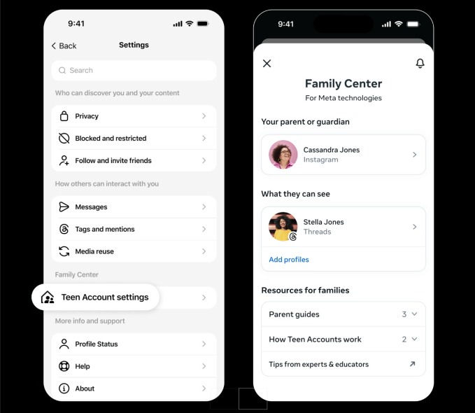
Nearly three years after Threads launched in July 2023, Meta is finally rolling out parental supervision tools for the platform. Starting next week in the U.S., parents and guardians will be able to monitor and manage their teen’s activity on the app through Meta’s Family Center — the same hub that already controls settings across Instagram and Facebook.

The move comes as Meta faces mounting pressure from regulators and lawmakers over teen safety. The company has been expanding parental controls across its apps for years, and Threads — now boasting 500 million monthly users — was a glaring gap. Lawsuits from multiple states and child safety advocates have only sharpened the spotlight.

So what can parents actually do? Quite a bit, it turns out.

Screen time tracking and daily limits

Parents will see exactly how much time their teen spends on Threads each day for the past week, including a weekly average. They can then set a daily time limit — and crucially, that limit applies across all devices. If a teen switches from phone to laptop, the clock keeps ticking.

Here’s what the new Threads parental supervision dashboard offers:

  • Daily time limit: Set a maximum number of minutes per day. Total time across devices is counted.
  • Sleep mode: Block or limit access during specific hours, especially at night. Meta already mutes notifications and turns on auto-replies for all teens from 10 p.m. to 7 a.m., but parents can tighten this further.
  • Privacy controls: Manage who can tag the teen in posts. Parents can also decide whether teens under 16 are allowed to change their default privacy settings — like private accounts — to something less restrictive.

Meta says teens on Threads already have built-in protections: private accounts by default, and limits on the content they see. But now parents have the final say on whether those settings can be loosened.

Why now? The pressure on Meta is real

It’s no secret that social media companies are under fire. Meta, along with TikTok, Snap, and others, faces a wave of lawsuits from states and school districts alleging that their platforms harm teens’ mental health. The U.S. Senate has held multiple hearings, and the Kids Online Safety Act (KOSA) is moving through Congress.

Threads was an obvious weak spot. While Instagram and Facebook have had parental controls for years, the text-based platform — which Meta positioned as a Twitter alternative — had none. For a company that says it prioritizes teen safety, that was a hard gap to explain.

Now, with these tools, Meta can argue that Threads is no longer the Wild West for teens. But critics note that supervision tools only work if parents actually use them — and many don’t.

What about the rest of the world?

The rollout starts in the U.S. next week. Meta told TechCrunch it plans to bring Threads parental supervision globally by the end of 2025. No specific countries or dates have been announced yet.

For parents outside the U.S., that means waiting — but not forever. And for teens? Well, the days of unlimited late-night scrolling on Threads may be numbered.

The bigger picture: Are parental controls enough?

Parental supervision tools are a step forward, but they’re not a silver bullet. A time limit doesn’t stop a teen from seeing harmful content during the minutes they are online. And Meta’s own research has shown that teens often find ways around parental controls — using friends’ phones, for example.

Still, the Threads parental supervision rollout is a meaningful addition. It gives parents a window into their teen’s digital habits, and a way to set boundaries without confiscating the phone entirely. For a platform that grew to half a billion users in less than three years, that kind of oversight was long overdue.

Whether it will satisfy regulators — or the parents filing lawsuits — is another question entirely.

Continue Reading

Social Media

Yope raises $12.3M to build a private social network without algorithms or ads

Published

on

Yope raises $12.3M

The pitch: social media without the noise

Yope, a social app that’s been quietly gaining traction, just announced a $12.3 million seed round. The money comes from investors who believe there’s room for a different kind of social experience—one built around private groups of friends and family, not algorithmic feeds or influencer content.

“We’re not trying to compete with TikTok or Instagram for attention,” a company spokesperson said. “We want to help people stay close to the people who actually matter.”

The app is already live and growing. Early users describe it as a cross between a group chat and a photo-sharing album, with a focus on spontaneity and intimacy. No ads. No recommendation engine. No public profiles.

What Yope actually does

At its core, Yope lets users create small, invite-only groups—typically for close friends, family, or a sports team. Inside those groups, members can share photos, send messages, and even use AI-powered features to enhance their interactions.

The AI tools aren’t about generating content for the masses. Instead, they’re designed to strengthen real-world relationships. For example, the app can suggest conversation starters based on shared memories, or automatically create photo albums from a weekend trip.

The company says it has no plans to introduce an algorithmic feed. “We don’t want to optimize for engagement,” the spokesperson added. “We want to optimize for connection.”

No algorithms, no ads—how do they make money?

That’s the obvious question. Yope’s answer: for now, they don’t need to. The $12.3 million seed round gives them runway to focus on product development and user growth. Eventually, they may introduce premium features or a subscription model, but the core experience will remain ad-free and algorithm-free.

It’s a bet that enough people are willing to pay for a private, peaceful social space. Early signals suggest they might be right. The app has seen steady organic growth, especially among users tired of the noise on larger platforms.

Why investors are betting on private social networks

The seed round was led by a group of venture capital firms that have been watching the backlash against public, algorithm-driven social media. Investors see an opportunity in the growing demand for private social networks that prioritize real relationships over viral content.

“People are exhausted by the performative nature of mainstream social platforms,” one investor told reporters. “Yope offers a quiet alternative.”

The trend is real. Apps like Dispo and VSCO have also tried to carve out spaces that feel less like a broadcast channel and more like a living room. Yope’s twist is its emphasis on messaging and AI features that serve small groups, not individual creators.

How Yope compares to WhatsApp and Signal

You might be thinking: isn’t this just a group chat? In some ways, yes. But Yope is designed specifically for sharing life updates in a visual, lightweight way—closer to a private Instagram than a messaging app.

Unlike WhatsApp or Signal, which are primarily text-based, Yope puts photos and videos at the center. And unlike Instagram, there’s no pressure to curate a perfect feed. Posts disappear after a set time, encouraging candid sharing.

The AI features are another differentiator. While Signal and WhatsApp have added some smart functionality, Yope is building tools specifically for group bonding—like automatically stitching together everyone’s photos from an event, or suggesting when to check in on a friend who’s been quiet.

What’s next for Yope

With the new funding, Yope plans to expand its team, improve the AI features, and scale the app to more users. The company is also exploring partnerships with family-focused apps and services that value privacy and real-world connection.

The goal is clear: become the default private space for the people you actually care about. Whether that’s a group of college friends sharing memes, a family sharing holiday photos, or a book club discussing the latest read.

“We’re building for the moments that don’t need to be public,” the spokesperson said. “The ones that are just for you and your people.”

In a world where every social platform is fighting for your attention, Yope is making a quiet bet that sometimes, less really is more.

Continue Reading

Social Media

Instagram Finally Lets You Swap the Music in Your Old Posts Without Killing Engagement

Published

on

Instagram Replace Audio

No more deleting and re-uploading just to change a song

Instagram announced Tuesday that users can finally swap out the music on published feed posts and carousels. Until now, the only way to change a track was to delete the entire post and start from scratch — losing every like, comment, and share in the process.

The new Replace Audio tool lets you update the soundtrack on any eligible post at any time. Your existing engagement stays intact. That means the likes, comments, shares, and reach all survive the swap. For creators and brands who obsess over metrics, that’s a big deal.

Instagram, owned by Meta, says the feature is part of a broader push to give creators more creative control over their content. It’s a small but meaningful update — and one that actually addresses a real pain point.

Why this matters for creators and brands

Music trends move fast on Instagram. A track that feels fresh in June can feel stale by August. Before this update, creators faced an ugly trade-off: keep the post’s hard-won engagement, or swap the song and lose everything. Brands running paid campaigns were especially vulnerable — deleting a post with thousands of dollars in ad spend behind it was simply not an option.

Now, you can keep the post alive and simply swap the audio. That means old content can be refreshed to match current trends. It also means you can correct a mistake — say, picking a track with licensing issues — without nuking the post’s performance.

For everyday users, the appeal is simpler: music taste evolves. That song you loved in 2022 might make you cringe today. Now you can quietly fix it.

How to use the Replace Audio tool

The process is straightforward. Here’s how it works:

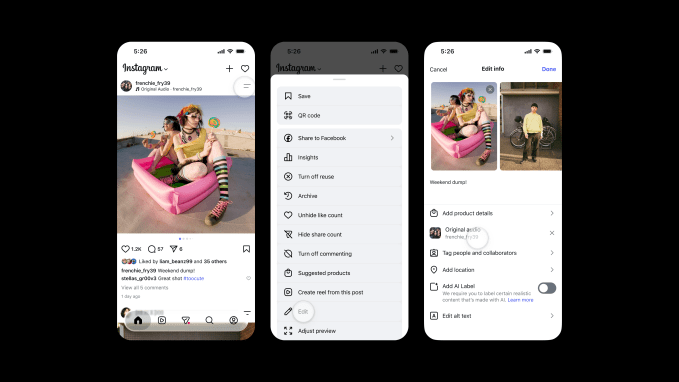
  1. Navigate to the feed post or carousel where you want to change the audio.
  2. Tap the two-line menu (the three-dot or hamburger icon) in the top-right corner of the post.
  3. Scroll down to find Edit.
  4. Inside the edit screen, you’ll see the option to swap out the audio. Tap it and choose a new track from Instagram’s music library.

That’s it. The new audio replaces the old one. The post’s visual content, caption, tags, and location remain untouched. The feature works on both single-image posts and multi-image carousels.

One thing to note: the feature only applies to posts that already have music attached. You can’t add music to a post that was originally published without it — at least not yet.

A rare win after a string of missteps

Instagram has taken plenty of heat lately for features nobody asked for. Last month, the company killed an AI-powered tool that let users modify photos from public Instagram accounts. The company admitted the feature missed the mark and pulled it.

In May, Instagram launched Instants, a feature meant to share real-time moments. It backfired badly. Many users accidentally sent images to their entire Friends list, sparking widespread frustration online.

Replace Audio feels different. It solves a genuine problem without forcing a new behavior on users. No AI drama. No accidental oversharing. Just a practical tool that makes an existing workflow less painful.

It’s also worth remembering that Instagram’s relationship with music has been complicated. Licensing deals with major labels come and go. Some tracks disappear from the library without warning. The ability to swap audio after the fact gives users a safety net when a song gets pulled.

What’s next for Instagram’s audio tools

The Replace Audio feature is rolling out now globally. It’s available on both iOS and Android. There’s no word yet on whether Instagram plans to extend the feature to Reels — the platform’s most music-heavy format — but it seems like a logical next step.

For now, the update is a quiet but welcome improvement. It won’t make headlines the way a new algorithmic change or a TikTok clone would. But for the millions of people who post music-backed content every day, it’s the kind of fix that makes the platform feel a little less frustrating to use.

Sometimes the best features aren’t flashy. They’re just the ones that remove a pointless barrier. Instagram’s Replace Audio tool does exactly that.

Continue Reading

Trending