Connect with us

How To

Stop Wasting Filament: 6 Slicer Settings That Slash Costs on Every Print

Published

on

save filament

The Real Cost of 3D Printing Isn’t the Printer

You saved up, bought the machine, and set it up. Feels good. But here’s the truth nobody tells beginners: the printer is the cheap part. The real money drain? Filament. Spool after spool, it adds up fast — especially when you’re cranking out desk organizers and trinkets that use way more plastic than they need to.

The solution isn’t buying cheaper filament. It’s smarter slicing. By tweaking just six settings in your slicer, you can save filament on nearly every print without sacrificing quality. Let’s get into it.

1. Reduce Infill Density — You Don’t Need 20%

Most slicers default to 20% infill. That’s overkill for 90% of prints. A phone stand, a pencil holder, a decorative vase — none of them need that much internal structure.

Drop infill to 10% or even 5% for non-functional parts. For purely decorative items, try 0% with 2-3 wall layers. The print will be hollow but still strong enough to sit on a shelf. This single change can save filament by 15-30% per print.

Need strength? Use lightning infill in Cura. It builds support only where needed, leaving the rest hollow. Same strength, far less plastic.

2. Optimize Wall Line Count

Three walls is the sweet spot for most prints. Four or five? That’s just extra plastic melting into the void. Unless you’re printing something that takes real abuse — like a tool handle or a bracket — stick to two or three wall lines.

Here’s a quick rule: for prints under 50mm tall, two walls are plenty. For taller or wider objects, three walls give you durability without waste. Each extra wall layer adds about 0.4mm of thickness and a surprising amount of filament usage over a full build plate.

3. Enable Adaptive Layer Height

Flat, featureless sections don’t need 0.1mm layers. Curved or detailed areas do. Adaptive layer height adjusts the layer thickness dynamically — fine layers on complex geometry, thicker layers on straight walls.

In Ultimaker Cura, it’s called “Adaptive Layers.” In PrusaSlicer, it’s “Variable Layer Height.” Enable it, set a maximum variation of 0.12mm to 0.28mm, and watch print time drop by 20-40% while using noticeably less filament. The quality stays high where it matters.

4. Use a Wider Nozzle — And Adjust Line Width

This one isn’t a slicer setting per se, but it changes how you slice. Swap your standard 0.4mm nozzle for a 0.6mm or 0.8mm one. Then set your line width to match the nozzle diameter.

A wider nozzle extrudes more plastic per pass, which means fewer passes to cover the same area. You’ll print faster and use less filament because the walls are thicker and stronger with fewer perimeter loops. For functional parts where surface finish doesn’t matter, a 0.8mm nozzle can save filament by up to 25% compared to a 0.4mm nozzle with the same wall count.

5. Turn Off Supports — Or Use Tree Supports

Supports are filament thieves. They print, then get thrown away. The best way to save? Avoid them entirely. Orient your model so overhangs face upward or use chamfers and fillets in your design.

When supports are unavoidable, switch to tree supports (Cura) or organic supports (PrusaSlicer). These branch-like structures use far less material than traditional grid supports. In my tests, tree supports used 40% less filament on a model with a 45-degree overhang. They also peel off cleaner, reducing post-processing waste.

Set support overhang angle to 60 degrees instead of the default 45. You’ll get fewer supports overall, and most printers can handle a 60-degree overhang without drooping.

6. Lower the Top Layers — And Use Ironing

Default top layer counts are often 4 or 5. That’s a lot of solid plastic on the top surface. Drop it to 3 for most prints. Combined with ironing (which flattens the top layer without adding extra filament), you get a smooth finish without the waste.

In Cura, enable “Ironing” and set flow to 10%. It re-melts the top surface and levels it, eliminating the need for extra top layers. Test it on a small cube first — ironing can add time, but it doesn’t add filament beyond a tiny amount.

Bonus: Print Multiple Objects at Once — But Use a Brim

Printing several small objects in one go saves time, but it can waste filament if you use a full brim on each. Instead, use a skirt (one perimeter around the entire group) or a brim only on the first object. This trick alone shaves grams off every multi-part print.

Combine all six settings, and you’ll easily cut filament usage by 30-50% across your projects. That’s real money back in your pocket — money you can spend on more filament, or maybe even a second printer.

Start with one setting change today. Your wallet will thank you.

Continue Reading

Social Media

Retro, the anti-algorithm photo app for friends, just banked $21M

Published

on

Retro photo-sharing app

Retro’s quiet $21M raise

The friend-focused photo-sharing app Retro has pulled in more than $21 million in Series A funding, according to an SEC filing spotted by Business Insider. The filing, dated August 19, sits under the startup’s legal name, Lone Palm Labs, and reveals the round actually closed back in December.

PitchBook now pegs the company’s valuation north of $100 million. Retro hasn’t commented publicly on the raise, and didn’t respond to a request for comment.

The money comes at a telling moment. Social media has become a firehose of creator content, algorithmically ranked and increasingly generated by AI. Retro’s pitch is almost contrarian: show photos to the people who actually know you.

Built by ex-Instagram engineers who saw the feed problem coming

Retro was founded by Nathan Sharp and Ryan Olson, two former Instagram product engineers. They watched the platform drift from a friend-sharing tool into a broadcast network dominated by influencers. Sharp told TechCrunch in December: “Something that has to be true and will be true is that people will still want to see more of their friends.”

His point cuts to the heart of the current social media malaise. The For You page is great for killing time, but it’s terrible for staying connected. Sharp again: “The photos and videos you take will need to find a place where they can reach the intended audience.”

Retro is that place. It strips away the algorithmic noise and puts the focus squarely on your inner circle.

From personal journal to shared photo space

Launched in 2023 as a personal photo journal, Retro has evolved. It now lets you privately share photos of your week with friends, create shared albums, view and share recaps, and even “rewind” to time-travel through old memories. The app has become a go-to for groups who want a shared visual history without the performance of posting to a public feed.

The growth numbers back up the concept. According to app intelligence provider Appfigures, Retro has been downloaded about 7 million times since launch. In-app spending has jumped more than 460% over the past 180 days — a sign that the people who do subscribe are sticking around and using it regularly.

No ads, just subscriptions

Retro’s business model is refreshingly simple: no advertising. Instead, the company offers in-app subscriptions that unlock features like video, GIF and sticker comments, more styles, unlimited history, and special app icons.

It’s a small subset of users who pay, but the company’s bet is that those who do are committed customers. The subscription model also aligns with the app’s ethos — your data and attention aren’t the product.

Who’s backing the anti-algorithm bet?

The investor list reads like a who’s who of tech and venture circles. Thrive Capital leads the round, joined by Figma CEO Dylan Field, Scribble Ventures, Box Group, Imaginary Ventures, Coalition, Conviction, Copper, Positive Sum, and a roster of angels.

The mix of strategic and financial backers suggests confidence in Retro’s vision. Field, who runs a design tool company, likely sees the value in a social app that prioritizes genuine connection over engagement metrics.

What Retro’s raise says about the future of social

The $21M round is more than just a milestone for one startup. It’s a signal that investors are betting on a future where social media returns to its roots — connecting real people with real friends. As AI-generated content floods mainstream platforms, the demand for authentic, private sharing spaces is only growing.

Retro isn’t trying to replace Instagram or TikTok. It’s carving out a niche for something more intimate. And with this fresh capital, the team plans to keep building features that make it easier to share moments with the people who matter most.

For anyone tired of doomscrolling through sponsored posts and AI slop, Retro’s photo-sharing app offers a quiet alternative. The question now is whether it can scale its niche appeal into something bigger. The early numbers suggest it’s on the right track.

Continue Reading

How To

5 Overlooked Pixel Apps I Added to My Home Screen Because I Kept Forgetting to Use Them

Published

on

overlooked Pixel apps

Why Your Pixel Home Screen Deserves a Second Look

Google’s Pixel phones are stuffed with exclusive features. That’s not hyperbole—it’s practically the brand’s identity. But here’s the thing: many of those features are hiding in plain sight, tucked inside apps you’ve probably swiped past a hundred times.

I’m guilty of it too. I’d buy a Pixel, marvel at the camera, then completely forget about the software tricks that make the phone genuinely useful. So I did something about it. I moved five overlooked Pixel apps to my home screen. Now I actually use them.

1. Recorder: The App That Transcribes Everything

You know that feeling when you’re in a meeting or lecture, and you desperately wish you had a transcript? The Pixel Recorder app does exactly that—and it’s been on Pixels since the Pixel 4.

It’s not just a voice recorder. It transcribes audio in real time, even when you’re offline. You can search for specific words in a recording, which is a lifesaver when you’re trying to find that one action item from a two-hour call.

I added it to my home screen because I kept forgetting I had it. Now, whenever I’m about to take notes on a conversation, I just hit record instead. The transcription is shockingly accurate, and it’s one of the most underrated Google Pixel features.

2. Now Playing: Your Personal Shazam, Always On

Every Pixel has a feature called Now Playing. It listens in the background and identifies music playing around you—no app needed. The catch? It’s buried in the settings, and most people never turn it on.

Here’s what I did: I added the Now Playing history shortcut to my home screen. It’s a widget that shows a list of every song the phone has recognized recently. Tap a song, and it opens in YouTube Music or your streaming app of choice.

Why does this matter? Because you won’t have to pull out your phone and open Shazam every time you hear a tune you like. The Pixel does it silently, and you just check the history later. It’s one of the best Pixel exclusive apps you’re not using.

3. Digital Wellbeing: More Than Just a Timer

Digital Wellbeing sounds like a guilt-trip app, but it’s actually a goldmine of hidden tools. The app tracks your screen time, sure, but it also has a Focus mode that silences distracting apps when you need to concentrate.

What really sold me, though, is the Wind Down feature. It shifts your screen to grayscale at a set time, which makes doomscrolling feel less appealing. I put a shortcut to Digital Wellbeing on my home screen because I kept forgetting to set it up properly.

Now I use it every evening. It’s a small nudge, but it’s genuinely changed how I wind down. If you’re looking for Pixel productivity tips, this is a good place to start.

4. Files by Google: The Cleanup Tool You Actually Need

Files by Google isn’t exclusive to Pixel, but it comes pre-installed and is deeply integrated. It’s not just a file manager—it has a smart cleanup feature that suggests old photos, memes, and unused APKs to delete.

I used to ignore it because I thought it was just a boring file browser. Then I checked the “Clean” tab one day. It found 2 GB of junk I didn’t know existed. That was the moment I moved it to my home screen.

The app also lets you share files offline with nearby devices, which is handy when you’re in a dead zone. If you’re tired of “storage full” notifications, this is the overlooked Pixel app you need.

5. Google Lens: The Visual Search Powerhouse

Google Lens is technically part of the Google app, but it deserves its own spot on your home screen. It’s a visual search tool that can identify plants, translate text in real time, and even solve math problems by pointing your camera at them.

I kept forgetting it existed because it’s hidden behind a few taps in the Google app. So I added the Lens shortcut directly to my home screen. Now, when I’m at a museum and want to know more about a painting, or when I’m trying to read a menu in another language, it’s one tap away.

It’s one of the most versatile hidden Google Pixel features, and it’s free. No reason not to use it.

How to Add These Apps to Your Home Screen

Adding any of these to your home screen takes about ten seconds. Here’s how:

  • Open your app drawer and find the app you want.
  • Press and hold the icon.
  • Drag it to your home screen.
  • For widgets like Now Playing, press and hold an empty spot on your home screen, tap “Widgets,” and search for the app.

That’s it. You’ll actually see them every time you unlock your phone, which is the whole point.

Don’t Let These Features Collect Dust

Pixels are packed with Google Pixel tips and tricks, but they only help if you remember they exist. Moving these five overlooked Pixel apps to my home screen was a small change that made a big difference in how I use my phone.

Try it. You might be surprised at how often you reach for them.

Continue Reading

How To

Windows 11 August 2026 Update: Apps Open Way Faster Now — KB5121003 Tested

Published

on

Windows 11 August 2026 update

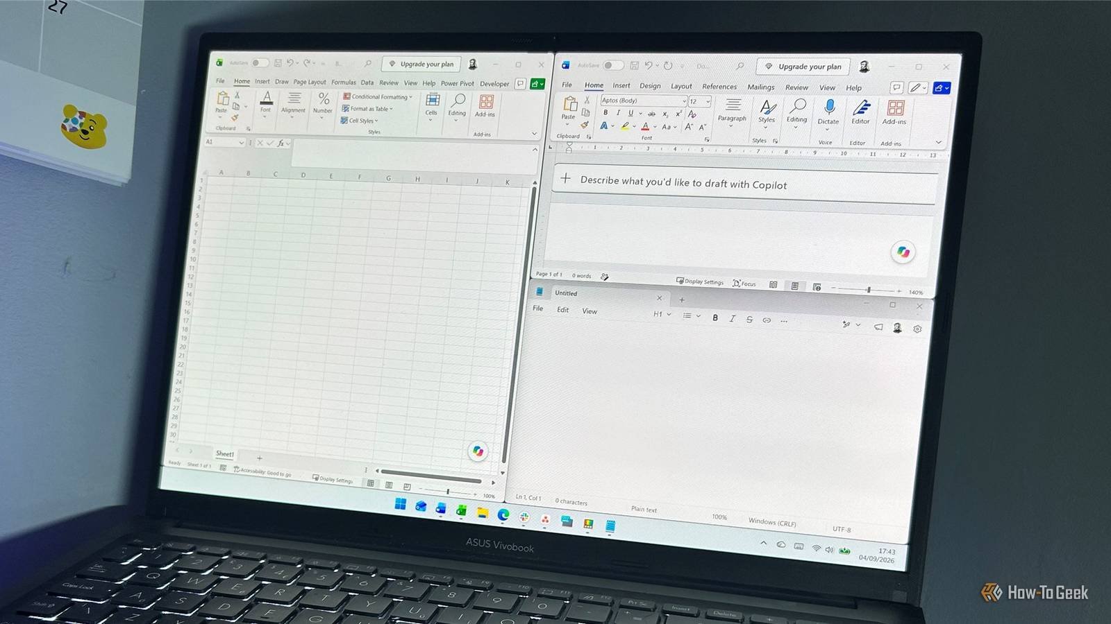
Imagine clicking an app icon and watching it spring to life instantly—no spinning cursor, no gray freeze, just pure speed. That’s exactly what Microsoft’s latest Windows 11 update promises, and after testing it myself, I can confirm: the difference is real. The August 2026 patch, KB5121003 (build 26200.9168), takes the CPU boost feature that previously only sped up the Start menu and search and extends it to your actual applications. The result? Apps open noticeably faster, and that annoying gray screen freeze after idle or boot is gone. Here’s what’s happening under the hood, why your CPU isn’t in danger, and why Microsoft probably should’ve done this years ago.

Continue Reading

Trending