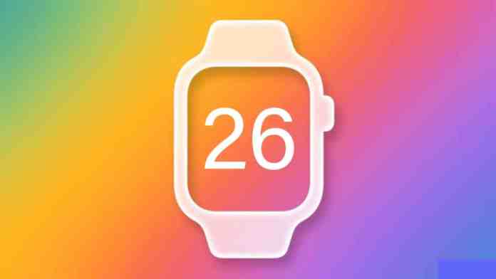
Exclusive: watchOS 26 Leaks Point to Major AI Integration, Custom Widgets, and VisionOS-Inspired Design
Rumors surrounding the next major update for the Apple Watch are intensifying. According to multiple sources, watchOS 26 leaks indicate a significant evolution, moving beyond incremental improvements to introduce smarter, more personalized, and visually cohesive features. This anticipated update, expected to be unveiled at Apple’s WWDC 2025, could redefine how users interact with their wrist-worn devices.
A New Era of Personalization with Third-Party Widgets
For years, Apple Watch users have requested greater control over their device’s interface. Building on this demand, the most compelling detail from the watchOS 26 leaks is the introduction of fully customizable third-party widgets for the Control Center. Currently, this quick-access panel is limited to Apple’s native toggles. Consequently, this change represents a fundamental shift in philosophy.
Imagine adding a battery widget from your favorite travel app, a live sports score complication, or a one-tap shortcut for your home automation system directly to your wrist. This level of customization promises to make the Control Center a truly personal command hub. Therefore, developers will gain a powerful new canvas to enhance utility, while users finally get the flexibility they’ve longed for.
How Custom Widgets Will Transform Your Workflow
The implications are substantial. Instead of swiping through multiple watch faces or diving into apps, essential information and actions could be just a swipe away. This means that checking your next calendar appointment, toggling a Focus mode, or monitoring your Wi-Fi strength could become instantaneous. The potential for streamlining daily interactions is immense, making the Apple Watch an even more efficient companion.
Apple Intelligence Comes to the Forefront
While AI features have begun to surface in recent updates, watchOS 26 leaks suggest a deeper, more integrated approach branded under “Apple Intelligence.” The goal appears to be making the watch not just a notification relay, but a proactive, context-aware assistant. However, it’s important to note that the watch itself may still rely on a paired iPhone for heavy computational tasks.
Expected tools include a smarter Focus Mode that dynamically filters notifications based on urgency, a Smart Summary feature for condensing long messages or emails, and Genmoji for creating unique emoji characters on the fly. These features aim to reduce digital clutter and save precious time, directly on your wrist. For a deeper look at how AI is shaping Apple’s ecosystem, explore our analysis on Apple’s broader AI strategy.
A Fresh, Unified Design Language
Beyond new features, a visual refresh is also on the horizon. Reports indicate Apple is drawing inspiration from the spatial interface of visionOS to create a more harmonious experience across all its platforms. As a result, watchOS 26, alongside iOS 26 and macOS 26, may receive a subtle yet noticeable design update.
You can anticipate refined icons, smoother animations, and improved visual consistency. This isn’t about a complete overhaul but rather a polishing of the interface to feel more modern and aligned with Apple’s latest design principles. The objective is clear: to ensure moving between your iPhone, iPad, Mac, and Apple Watch feels seamless and intuitive.
Enhanced Accessibility and Inclusivity
True to its core values, Apple is reportedly doubling down on accessibility. New features highlighted in the leaks are designed to make the Apple Watch more powerful for users with diverse needs. These include expanded Live Captions supporting more languages, enhanced Live Listen controls for hearing assistance, and the introduction of “Accessibility Nutrition Labels” on the App Store.
This latter feature would allow users to see detailed accessibility information for apps before downloading them. Such initiatives underscore Apple’s commitment to building technology for everyone. To understand how these features build on past efforts, read our guide on maximizing Apple Watch accessibility.
Release Timeline and What You Need to Know
So, when can you expect these changes? The official announcement is slated for Apple’s Worldwide Developers Conference (WWDC) in June 2025. Following the developer beta, a public beta will likely arrive in July, with the final, stable release of watchOS 26 expected in September, coinciding with new iPhone models.
Regarding compatibility, while not officially confirmed, it is expected to support Apple Watch models from Series 6 onward. Naturally, to access all new features, a compatible iPhone running iOS 18 will be required. If you’re considering installing the beta, proceed with caution. Beta software can be unstable, and downgrading is not straightforward.
The Road Ahead: Smarter Health and Wellness
Looking beyond the immediate leaks, the trajectory points toward a health-centric future powered by AI. Rumors persist about advanced sensors for blood pressure monitoring and non-invasive glucose tracking, though these may not materialize in watchOS 26. The foundation being laid now—with smarter notifications, personalized summaries, and a more adaptable interface—sets the stage for the Apple Watch to become an even more indispensable health guardian.
In summary, the watchOS 26 leaks paint a picture of a mature platform ready for its next leap. By blending powerful AI, user-requested customization, and a refined design, Apple is preparing an update that aims to make the Apple Watch feel both more personal and more capable than ever before. All eyes are now on WWDC for the official confirmation.


 CyberSecurity1 month ago
 CyberSecurity1 month ago
 Infosecurity1 month ago
 CyberSecurity1 month ago
 CyberSecurity1 month ago
 How To4 weeks ago
 CyberSecurity1 month ago
 How To3 weeks ago